Building Utilization Dashboards That Drive Decisions
How to design an equipment utilization dashboard that leads to action. Seven KPIs that matter, alert thresholds, review cadence, and how to present utilization data to leadership.
Your company has a beautiful dashboard. Color-coded charts. Real-time updates. Nobody's looked at it since launch day.
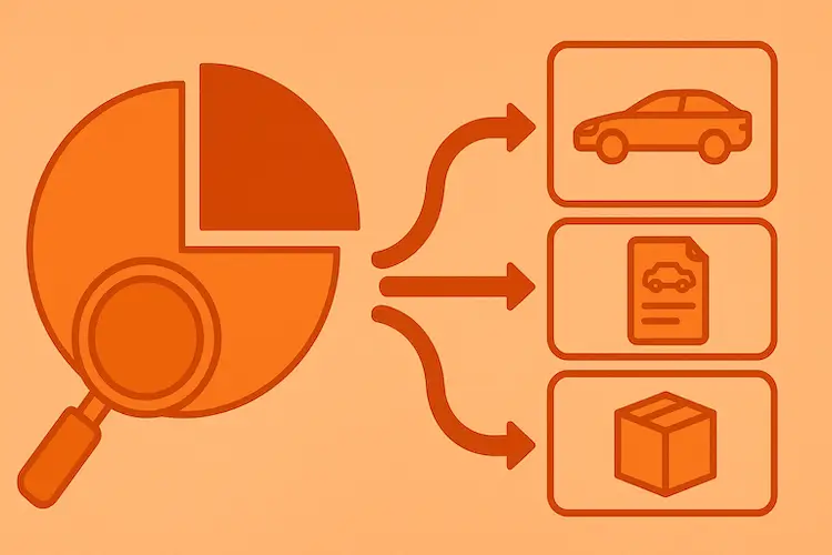
The most common dashboard failure is the same everywhere I've seen it: beautiful reporting with zero action. Heatmaps, pie charts, trend lines, real-time data flowing in from three or four systems, and the screen stays running 24/7 between quarterly reviews. The data is there. The visualisations are there. What's missing is the connection between "here's a number" and "here's what we do about it".
An equipment utilization dashboard isn't useful because it shows data. It's useful because it makes a decision easier, faster, and evidence-based. This guide is about building that connection: turning a wall display into a tool that someone actually opens on Monday morning and acts on. It's part of the broader asset utilization measurement framework. If you've already set up tracking (maybe using QR-based scanning) and have some data flowing, this is the next step.
The problem with most asset dashboards
Most dashboards fail for one of four reasons, usually in combination.
Too many metrics. When everything is a KPI, nothing is. A dashboard with 25 numbers is a spreadsheet with colours. The human brain processes 5-7 items at a glance; beyond that, you're just decorating.
No context. "Utilization rate: 47%" tells you nothing without a benchmark or target. Is that good? Bad? Trending up? Pair every number with a target or trend direction, or expect people to ignore it. (Check the industry benchmarks for your asset type, the answer to "is 47% good" depends entirely on what kind of asset you're tracking.)
No recommended action. This is the biggest gap. A dashboard shows what is; a useful dashboard shows what to do about it. "Utilization rate: 47%. Target: 65%. Recommended: reallocate 3 idle units from Building B." That's the difference between information and intelligence.
Wrong audience. A dashboard built for the COO should look nothing like one built for a department manager. Different people need different data at different levels. One dashboard for everyone is perfect for no one.
The fix isn't a better visualisation tool. It's a shift in how you design: start with the decision you want enabled, then build the data around it. Understanding which KPIs to track is half of it. Knowing what to do when those KPIs move is the other half, and the half most dashboards skip.
The 7 equipment utilization metrics that actually matter
Out of the dozens of things you could track, these seven are the ones that consistently drive action. If you can only watch seven numbers, watch these.
1. Average utilization rate, by category
Total time in use divided by total available time, expressed as a percentage. This is the headline number, the one that tells you at a glance whether a category of assets is healthy. Track it by category, not as a single org-wide average; mixing laptops and excavators into one number tells you nothing.
What "healthy" looks like depends on industry and asset type. The benchmarks guide breaks it down. As a rough orientation: below 40% signals candidates for pooling or retirement, above 85% signals capacity strain, and the 50-75% range is generally healthy.
Track monthly. A rising trend means your optimisation work is paying off; a falling trend means dig into specific categories before it becomes a portfolio-wide problem.
2. Idle asset count and value
Count of assets at 0% utilization for 30+ days, multiplied by their purchase value (or current book value for a more conservative number). This is the "money sitting in the closet" metric, wasted investment made tangible. "$45,000 in equipment unused for 60+ days" gets a CFO's attention in ways that utilization percentages don't.
Aim for zero in theory, expect 5-10% in practice. Above 15% means there's a systemic problem, whether over-purchasing, broken reallocation, or ghost assets nobody knows about.
This is your action list. Every idle asset needs a decision: retire, reallocate, or pool. Sort by value and deal with the $10,000 idle CNC machine before the $50 idle keyboard.
3. Cost of underutilization
For each underutilized asset: (target utilization − actual utilization) × asset value ÷ expected useful life. A simpler version: monthly depreciation × (1 − utilization rate). If a $12,000 laptop depreciates at $333/month and sits at 20% utilization, you're losing $267/month on it.
This metric translates utilization gaps into dollars, the language that gets budget attention. "We have 30 underutilized laptops" is mildly interesting. "We're losing $8,000 per month in depreciation on equipment nobody uses" is a conversation starter.
Track the trend, not the absolute number. You'll never get to zero (some underutilization is normal). But if the number is growing quarter over quarter, your procurement is outpacing your actual needs.
4. Utilization trend
Compare this month's average utilization to the rolling 3-month average. Direction matters more than precision: trending up, flat, or trending down.
A single month is a snapshot. Three months is a signal. Six months is a pattern you can act on with confidence. If improving, document what changed and keep doing it. If declining, investigate before it becomes a crisis. Declining trends usually mean new assets were added without retiring old ones, a team grew but their equipment stayed the same, or seasonal demand is shifting.
5. Peak vs. off-peak spread
Peak-hour utilization divided by off-peak utilization. Or simply: max during the busy window vs. min during the quiet one.
This reveals scheduling opportunities. If equipment runs at 95% between 9 and 11am and 20% after 3pm, you don't need more equipment. You need better scheduling. A spread above 3:1 usually signals a scheduling problem dressed up as a capacity problem.
High spread → flatten the curve. Stagger shifts, change booking rules, incentivise off-peak usage. This is one of the most cost-effective optimisations available because it requires zero additional equipment, just better time management.
6. Time-to-first-use, for new assets
Days between asset receipt and first recorded use. This catches the "bought it but nobody used it" problem. If a new laptop sits in receiving for three weeks before anyone touches it, your procurement-to-deployment pipeline has a bottleneck, or the asset wasn't needed in the first place.
Under 7 days is healthy for standard equipment. Under 3 days for anything bought to fix an urgent capacity gap. Over 30 days means something went wrong in the requisition process.
High time-to-first-use on a specific asset type usually points to one of three causes: procurement running ahead of actual need (slow down the buying cadence), setup or provisioning taking too long (streamline IT onboarding), or the requesting department not actually needing it as urgently as they claimed (tighten approvals).
7. Maintenance-to-utilization ratio
Hours in maintenance divided by hours in use. Or: maintenance cost divided by usage hours. This catches the moment when an asset is costing more to maintain than it's worth to operate. A 60% utilization rate sounds healthy until you realise 25% of that asset's time is spent in repair. Effective utilization is really 45%.
Below 10% is normal for most equipment. 10-20% signals aging assets approaching retirement. Above 20% is a red flag: the asset is broken more often than it should be. Combined with TEEP and OEE in manufacturing environments, this metric gives you the complete picture.
A rising ratio means it's time to schedule the buy or retire decision. A sudden spike points to a specific failure (bad part, misuse, environmental issue). A consistently high ratio across an entire category means the fleet itself needs replacement planning.
Designing your dashboard layout
One dashboard for everyone is a dashboard for no one. Different roles need different views: different metrics, different levels of detail, different action items. Three views cover most organisations.
The executive dashboard
For the CFO, COO, or VP of Operations. Reviewed monthly or quarterly. Design principle: big numbers, minimal detail, dollar impact.
Show total portfolio value and overall utilization rate as a single headline. Cost of underutilization as a dollar figure. Idle asset value (money sitting in closets). A trend arrow, just the direction, not the detail. The top three recommended actions with estimated ROI.
Don't show individual asset details, department-level breakdowns, or maintenance schedules. Executives need the strategic picture and a clear "here's what we should do". If this view doesn't make the CFO ask a question, redesign it.
The operations dashboard
For the operations manager, IT manager, or facilities lead. Reviewed weekly. Design principle: actionable categories, alert-driven.
Show utilization by category (laptops, projectors, vehicles). An alert panel for assets crossing threshold boundaries (newly idle, newly overstressed). Overdue checkouts if you run shared pools. Maintenance queue against utilization impact. A sortable equipment usage report.
This is the working dashboard, the one someone opens every Monday to decide what needs attention this week. It should answer three questions: Is anything on fire? What's trending the wrong way? What actions are overdue?
The department dashboard
For department heads and team leads. Reviewed on demand or monthly. Design principle: my team's assets, simple actions.
Show this department's assets and their utilization rates. Assets the team can request from pools or other departments. Pending actions (overdue returns, maintenance requests). Month-over-month comparison.
Keep it simple. Department managers don't need portfolio-level analytics. They need to know which of their assets are being used, which aren't, and what to do about the ones that aren't. A clean view with clear status indicators beats a complex analytics screen every time.
Setting up dashboard alert thresholds
This is where dashboards stop being passive displays and start being active management tools. Alerts turn "someone should check the data sometime" into "this specific thing needs attention right now".
| KPI | Warning (Yellow) | Critical (Red) | Recommended Action |
|---|---|---|---|
| Utilization rate | Below 30% for 30 days | Below 20% for 60 days | Review for retirement/reallocation |
| Utilization rate | Above 85% for 14 days | Above 95% for 7 days | Plan capacity addition |
| Equipment idle time | 30 days no use | 60 days no use | Auto-flag for idle asset report |
| Checkout overdue | 24 hours past due | 72 hours past due | Escalate to manager |
| Time-to-first-use | > 14 days | > 30 days | Investigate procurement pipeline |
| Maintenance ratio | > 15% | > 25% | Evaluate replacement |
| Cost of underutilization | Growing 10%+ MoM | Growing 20%+ MoM | Emergency review meeting |
Three implementation layers, in increasing maturity.
Visual indicators on the dashboard itself: traffic-light colours, green for healthy, yellow for watch, red for act. This is the minimum every dashboard should have.
Email notifications when an asset crosses a threshold. "Laptop #47 has been idle for 30 days. Action needed." This catches things between dashboard reviews when nobody's actively watching.
Automated workflows when an asset hits a critical threshold. The system creates a task or ticket and assigns an owner. "Equipment #47, idle 60 days, review for retirement. Assigned to Operations Manager." This is the gold standard, because data-driven decisions happen automatically rather than depending on someone remembering to check.
Most organisations start at the first layer, add the second within a few months, and reach the third once the process has matured.
From dashboard to action: the review cadence
A dashboard without a review cadence is like a gym membership without a workout schedule. You have the tools, but you're not using them. A consistent rhythm is what makes data-driven decisions habitual rather than occasional.
Weekly: the five-minute scan
Operations manager. Monday morning. Open the operations dashboard and look at three things: any red alerts (handle immediately), any new yellows since last week (note for the monthly review), any overdue checkouts or returns (send reminders).
That's it. Five minutes. The goal isn't deep analysis. It's catching fires early.
Monthly: the 30-minute department review
Each department reviews their equipment usage. The agenda: utilization overview (trending up, down, or flat?), idle assets (what hasn't been used, why, and what's the decision: retire, reallocate, or keep with justification), high-demand assets (anything consistently above 85% that means we need to add capacity?), action items from last month (what did we decide, did it happen?).
Output: a one-page summary with three to five action items. Same structure every month, so people know what to expect and progress is trackable.
Quarterly: the strategic decision meeting
This is where the executive dashboard earns its keep. Leadership reviews portfolio health (overall utilization trends), financial impact (dollar losses from idle and underused assets this quarter vs. last), major decisions (buy, lease, retire, or reallocate for high-value assets), and budget implications (how utilization data should influence next quarter's capex).
This meeting should end with funded decisions, not "let's look into it". The data is already there. Quarterly is the time to act on it.
Annual: capital planning input
Once a year, utilization data feeds directly into the budget planning process. You walk in with last year's utilization trends by category, the list of assets scheduled for retirement (with recovery value), the capacity gaps that need purchasing or leasing, and the ROI of asset optimisation initiatives (dollars saved through reallocation, pooling, retirement).
If your CFO is still making equipment budget decisions without utilization data, this annual review is the chance to change that.
Presenting utilization data to leadership
Different leaders care about different things. Tailoring the presentation to the audience is the difference between "nice report" and "approved budget".
The CFO wants dollar figures. Cost of idle assets, savings from reallocation, avoided purchases. ROI of the tracking program itself. Capital efficiency. A template line that lands: "We have $45,000 in idle equipment. Reallocating 60% would avoid $27,000 in new purchases this quarter. Net improvement: $27,000 in capital efficiency."
The COO wants operational impact. Are teams waiting for equipment? Are things breaking because they're overstressed? How fast do new assets get deployed, and how quickly are idle ones recycled? Where's the risk: any equipment categories at >90% utilization with no backup plan? A template line: "Three equipment categories are running above 90% utilization with no buffer. One failure would cause specific operational impact. Recommendation: add one backup unit per category, total investment $X."
The IT Director wants asset lifecycle data. What's aging out, what needs refresh, what's under-provisioned? Compliance: are all assets accounted for, any ghost assets? Support cost correlation between equipment age, utilization, and ticket volume. A template line: "47 laptops are over 4 years old with maintenance ratios above 20%. Replacing them with 35 new units (right-sized based on actual utilization) would reduce support tickets by an estimated 40% and save $12,000/year in repair costs."
Common reporting mistakes
Showing too many metrics
Twenty KPIs on one screen isn't comprehensive. It's overwhelming. When presented with too much data, people look at nothing. Limit each dashboard view to 5-7 metrics. If someone needs more detail, let them drill down; don't front-load it.
Numbers without context
"Utilization: 55%." So what? Always pair numbers with benchmarks, targets, or trend direction. "Utilization: 55% (target: 65%, trending up from 48% last quarter)." Now there's something to decide.
No recommended action
Every metric on a dashboard should have an implied or explicit "if X, do Y". Red alert on idle assets → link to the retirement review process. High utilization warning → link to the capacity planning workflow. The dashboard should answer "what do I do?", not just "what's happening?"
Reporting monthly when action is needed weekly
If an idle-time alert fires on March 1st but nobody sees it until the March 31st monthly review, you've wasted a month. Match reporting frequency to action urgency. Idle asset detection: weekly minimum. Overdue checkout: real-time. Quarterly strategic trends: monthly is fine.
One dashboard for all audiences
The CFO doesn't need to see checkout durations. The department manager doesn't need portfolio-level financial metrics. Building separate views is more work upfront but dramatically increases adoption: each person sees exactly what's relevant to their decisions.
Building it and walking away
A dashboard is a living tool, not a one-time project. KPIs evolve as the organisation matures. Thresholds need adjustment as you learn what's normal for your environment. New asset categories appear, old ones retire. Plan 30 minutes of dashboard maintenance per quarter: review whether the metrics, thresholds, and layouts still match the decisions you actually need to make.
Getting started: your first utilization dashboard
You don't need a fancy BI tool to learn what works. Here's the minimum viable setup.
Start by picking your top five metrics. From the seven above, choose the ones most relevant to your situation right now. If you're early in this, I'd start with average utilization rate, idle asset count, underutilization dollar impact, utilization trend, and one of {peak spread, time-to-first-use, maintenance ratio} based on your biggest current pain point.
Pull the data into whatever you've got. A spreadsheet works fine. Create a template with columns for each KPI, rows for each asset category, formulas that auto-calculate from your raw data. This becomes your utilization report template. You'll refine the format over time.
Set initial thresholds using the alert table above as a starting point. Adjust based on your industry benchmarks and your gut sense of what's normal. The initial settings don't need to be perfect; you'll tune them as you learn.
Share the first report with your stakeholders. Keep it simple: "Here's what our utilization data says this week. Here are three things I think we should do about it." Attach the data. Include your recommendations. Make it easy for the person reading to say yes.
After that, establish your rhythm. Weekly five-minute scan. Monthly 30-minute review. Iterate the dashboard based on the questions people ask: if the same one comes up three times, add a metric that answers it.
The framework gets refined over time. Thresholds shift as you learn what's normal for your environment. New asset categories appear, old ones retire. The point isn't building the perfect dashboard once; it's building something workable and then making decisions on it consistently. The organisation that tracks utilization and reviews it on schedule will always outperform the one that tracks but ignores. Both will outperform the one that doesn't track at all.
Where UNIO24 fits
I'm the founder of UNIO24. The patterns in this playbook (KPIs that drive action, alert thresholds that trigger workflows, separate views for executive, operations, and department audiences) are exactly what we built into the product. Watching dashboards turn into wallpaper is what pushed us to ship something different.