Asset Utilization Benchmarks: What's Normal for Your Industry?
Equipment utilization benchmarks for healthcare, IT, construction, manufacturing, education, and logistics. What a good utilization rate looks like, and when your numbers signal a problem.
"Our utilization rate is 55%. Is that good?" The honest answer: it depends on what you're measuring.
Someone asked me this exact question not long ago. They'd gone through the effort of measuring utilization (followed the framework from our main playbook, collected 30 days of data, crunched the numbers) and landed on 55%. Then they Googled "what is a good utilization rate" and found everything from 28% to 90% depending on the source. Not exactly helpful.
Here's the thing: 55% utilization on a $2 million MRI machine is terrible. That machine costs you money every hour it sits idle. But 55% on a pool of shared conference room projectors? That's probably fine: it means they're available when people need them without creating bottlenecks. Same number, completely different conclusion.
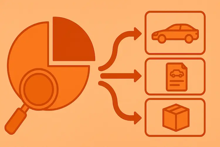
This guide exists because universal benchmarks are dangerous. A number without context leads to bad decisions. What you need are equipment utilization benchmarks that account for your industry, your asset type, and the way your equipment is actually used. That's what I've tried to compile here: a breakdown of equipment utilization rate by industry, based on real data, conversations with people who manage these assets daily, and what I've seen work in practice.
Why Universal Benchmarks Don't Work
Every article about utilization quotes some version of "aim for 70-85%." And that number isn't wrong, exactly. It's just useless without context. Let me explain why.
Three factors make the same utilization percentage mean completely different things.
Asset cost. A $300 keyboard at 30% utilization? Nobody cares. A $150,000 excavator at 30% utilization? That's roughly $500-800 per idle day in depreciation, insurance, financing, and storage. The higher the asset value, the more every percentage point matters.
Usage pattern. Some assets run continuously: servers, production machinery, fleet vehicles. Others are inherently intermittent (projectors, lab equipment, seasonal tools). Expecting continuous-use benchmarks from intermittent-use assets is like judging a fire extinguisher by how often it's used. It's supposed to be available, not busy.
Cost of unavailability. When an MRI scanner breaks down, patients get rescheduled, revenue drops, and people don't get diagnosed. When a spare monitor breaks down, someone waits a day for a replacement. The consequence of being at 100% (no buffer) is wildly different depending on what breaks.
One more concept worth knowing: the difference between asset utilization and OEE (Overall Equipment Effectiveness). Utilization measures time in use vs. total available time. OEE goes deeper: it factors in performance speed and output quality too. Utilization tells you "is the machine running?" OEE tells you "is the machine running well?" For most non-manufacturing organizations, utilization rate is the right metric. For manufacturing, you'll want both. We'll touch on OEE in the manufacturing section below.
With that context, let's look at what "normal" actually looks like in specific industries.
Healthcare: Medical Equipment
Healthcare is where utilization benchmarks get the most attention, because the equipment is absurdly expensive and directly tied to revenue and patient outcomes.
Diagnostic Imaging (MRI, CT, X-Ray)
These are the big-ticket items. An MRI machine costs $1-3 million. A CT scanner, $500K-2M. When they're idle, hospitals bleed money. When they're at 100%, patients wait weeks for appointments.
Target MRI utilization rate: 60-80%
This is the range where most well-managed imaging departments operate. At 60%, there's comfortable scheduling buffer: room for emergency scans, maintenance windows, and staff breaks. At 80%, the department is running efficiently but needs careful scheduling to avoid bottlenecks.
Research consistently shows that hospitals carry about 25% more imaging devices than they can use at any given time. That's not necessarily waste. It's capacity for peak demand, equipment rotation during service, and redundancy for critical care. But it does mean that if your MRI is sitting at 40% utilization, you should be asking hard questions.
Red flag: Any imaging equipment consistently below 50% needs investigation. Either it's in the wrong location, the scheduling process is broken, or you have more capacity than your patient volume requires.
What complicates measurement: MRI utilization isn't just "machine on vs. machine off." Between patients, there's room turnaround, patient prep, coil changes, and protocol setup. A well-run MRI suite might have the machine actively scanning only 60% of the available time, but the other 40% isn't waste. It's necessary workflow. When benchmarking, make sure you're comparing scan-time-to-available-time on the same basis as your peers, or you'll think you're underperforming when you're actually in line.
Also worth noting: utilization patterns differ dramatically between inpatient and outpatient imaging. Outpatient MRIs run on tight schedules during business hours: high utilization by design. Inpatient imaging is driven by clinical need, less predictable, harder to schedule efficiently, and naturally lower in utilization. Don't compare the two without accounting for the mix.
Patient Care Equipment (Monitors, Infusion Pumps, Ventilators)
Target range: 75-90% utilization
This equipment moves with patients. It's assigned to beds, rooms, or wards, and should be in use whenever patients are there. High utilization is expected and healthy. The concern isn't idle equipment. It's not having enough when census spikes.
Red flag: If utilization drops below 60% ward-wide, check for hoarding. Nurses sometimes stash extra infusion pumps (the IV drip machines) and monitors in supply closets "just in case." Those are ghost assets hiding in plain sight, technically assigned to the ward, practically invisible to the system.
Mobile Equipment (Wheelchairs, Beds, Transport Gear)
Target range: 50-70% utilization
These assets are inherently intermittent, used for transport, then parked. The benchmark here isn't about maximizing time in use. It's about availability: can someone find a wheelchair when they need one? If utilization is too high (above 85%), staff waste time searching for available equipment. Too low (below 40%), you've over-purchased.
Unique factor: Sterilization and cleaning cycles create mandatory downtime between uses. Factor that into your available time calculation, or your utilization numbers will look artificially low.
IT & Office Equipment
IT equipment utilization is the category most companies start with, because it's the largest by unit count and the easiest to measure. It's also where some of the biggest surprises hide.
Assigned Laptops and Desktops
Target range: 85-95% utilization
Wait. That high? Yes. If a laptop is assigned to an active employee, it should be in use nearly all the time. That's the whole point of assigning it. An assigned laptop at 50% utilization means one of two things: the employee doesn't need it (rare), or the employee has it but isn't using it (much more common: think about people who got a laptop on day one and now work exclusively from their desktop).
How to measure: "In use" means powered on and actively used at least once in the past 14 business days. Not just "assigned in the system." The gap between "assigned" and "actually used" is where ghost assets live.
Red flag: Any assigned device not powered on for 30+ days. That's either a ghost asset or an employee who needs a check-in, not a new device. When someone asks "what's a good laptop utilization rate?", for assigned devices, anything below 85% deserves a closer look.
I once helped a company audit 400 assigned laptops. Sixty-two of them hadn't been powered on in over 60 days. Twenty-three were assigned to employees who had left the company months ago. The devices were still sitting in their desk drawers, depreciating quietly. Another fifteen belonged to people who had switched to desktops but never returned the laptop "just in case." That's $55,000 in hardware doing absolutely nothing. A 15-minute report revealed what years of purchase orders had hidden.
Shared / Pool Laptops and Tablets
Target range: 55-75% utilization
Shared devices are different. They sit in a pool and get checked out as needed, for visitors, temporary projects, training sessions, field work. You need some slack in the pool so devices are available when someone needs one.
How to calculate pool size: Here's a practical formula. Track peak concurrent checkouts over 30 days. Your pool should be that peak number plus 20-30% buffer. If the highest number of simultaneously checked-out devices was 15, your pool should be 18-20. More than that, and you're paying for assets that never leave the shelf. Less, and people wait.
Red flag: Below 40% means the pool is too big. Above 85% means people are waiting in line and probably buying their own workarounds (which creates shadow IT, a whole other problem). For more on organizing shared device pools, see our guide on building asset sharing pools.
Meeting Room AV Equipment (Projectors, Screens, Video Conferencing)
Target range: 40-65% of room-booked hours
Meeting room utilization is tricky because there are two numbers, and most people only track one. Room booking utilization (how often the room is booked) and equipment usage utilization (how often the AV equipment in the room is actually powered on and used). The gap between these two is typically 30-40%. Rooms get booked for calls that happen on laptops. Rooms get booked "just in case" and then canceled without updating the calendar. Rooms get booked for 2 hours when the meeting takes 45 minutes.
The AV equipment utilization against actual meeting time is what matters. And 40-65% is healthy. It means equipment is available when needed without being a bottleneck.
Printers and Scanners
These are best measured by volume (pages per month) rather than time utilization. A printer that handles 5,000 pages/month on a 10,000 page/month rated capacity is at 50%, healthy. One handling 500 pages on the same capacity? Consider consolidating.
Red flag: Multiple printers in the same area each handling under 20% of rated volume. That's a consolidation opportunity hiding in plain sight.
Network Equipment (Switches, Routers, Access Points)
I'll mention this briefly because it's often overlooked. Network infrastructure is "always on": utilization in the traditional sense doesn't apply. What matters is throughput utilization: how much of the available bandwidth or port capacity is being used. A 48-port switch with 12 ports connected is at 25% port utilization. That's not necessarily bad (you need capacity for growth), but if you're buying more switches while existing ones are mostly empty, the same reallocation logic applies.
For most organizations, network gear falls under IT infrastructure planning rather than asset utilization management. But if you're tracking IT assets comprehensively, it's worth including in your visibility picture.
Construction & Heavy Equipment
Construction has the most established utilization tracking culture, partly because the equipment is so expensive that idle time is impossible to ignore. The construction equipment utilization rate matters enormously: a $150,000 excavator sitting in a yard costs $500-800 per day in depreciation, insurance, and financing. Every day it doesn't work, you're writing a check to nobody.
Heavy Machinery (Excavators, Dozers, Graders, Loaders)
Target range: 60-75% utilization
The industry target is generally around 65%. High-performing contractors push 70%+. Below 50% is considered underperforming.
But here's the important nuance: utilization varies enormously by project type. An excavator on a highway project might hit 80% because there's continuous digging work. The same excavator on a residential development might sit at 45% because it's needed for specific phases, then waits. Judging utilization without accounting for project mix is misleading.
How to measure: For heavy equipment, hour-meter data is the gold standard. Engine hours divided by available hours. Calendar-based tracking (is it deployed to a site or in the yard?) is a reasonable proxy if you don't have telematics.
Industry rule of thumb: The 70/30 ratio. Aim for 70% of your fleet deployed to job sites, 30% at yards (for maintenance, standby, and rotation). If your ratio is 50/50, you either have too much equipment or not enough projects.
Rental vs. owned: Here's where utilization data gets strategically interesting. If your owned excavator is at 45% utilization, you might be better off selling it and renting when needed. The break-even point varies, but as a rough guide: if an asset is below 50% utilization consistently, renting for peak periods is almost always cheaper than owning year-round. The buy/lease/retire decision framework goes deeper on this math.
Seasonal patterns: Construction is deeply seasonal in most climates. Expect 70-80% utilization during building season and 20-40% during winter or rainy season. Annual averages will look misleadingly low. Benchmark by season, and plan your fleet decisions around peak demand, not annual numbers.
Tools and Light Equipment
Target range: 40-60% utilization
Hand tools, power tools, small generators, laser levels: these move constantly and are used intermittently. Nobody runs a circular saw for 8 straight hours. The benchmark is more about availability and loss prevention than maximizing usage time.
Red flag: Tools that haven't been checked out in 90+ days. Either they're broken, lost, or you bought more than you need. This is where a simple check-in/check-out system pays for itself, not to maximize utilization, but to find the tools that have gone missing.
The real cost of light equipment isn't idle time. It's replacement purchases caused by poor visibility. Most construction companies I've talked to estimate they re-buy 10-15% of their small tool inventory annually because they can't find what they already own. At scale, that's tens of thousands of dollars a year. Even basic QR-based tracking (just knowing where each tool was last seen) cuts that number dramatically. See our guide on tracking utilization with QR codes for how to set this up cheaply.
Fleet Vehicles
Target range: 65-80% utilization
Measured in miles or engine hours per available day. A truck that's available 22 days a month and runs 16 of them is at 73%, solid. The cost of idle fleet vehicles is especially painful because they depreciate on a calendar basis regardless of use, plus insurance, registration, and storage.
Red flag: Any vehicle idle for more than 2 consecutive weeks without a scheduled reason (maintenance, seasonal standby). That's a candidate for disposal or reallocation. A healthy fleet utilization rate for construction sits in the 65-80% range. If individual vehicles consistently fall below 50%, it's time to sell or reassign them.
A note on telematics: If your fleet has GPS/telematics, you already have utilization data. You just might not be looking at it from a utilization angle. Most GPS tracking platforms report engine hours and idle time. Pull that into your utilization analysis and you'll have the most accurate picture possible without any additional tracking effort.
Manufacturing
Manufacturing is where utilization tracking gets most sophisticated, and where the numbers can be most humbling.
The Uncomfortable Average
Here's a number that shocks most people: the average equipment utilization in manufacturing is roughly 28%. Not 78%. Twenty-eight. That means the typical factory floor is idle more than 70% of the time. When you factor in planned downtime, changeovers, breaks, unplanned maintenance, quality losses, and speed losses, what looks like a busy factory is actually incredibly inefficient by the numbers.
World class manufacturers hit 80%+ utilization, a world class utilization rate that takes years of systematic improvement, not weeks.
Machine Utilization Rate vs. OEE (OEE vs Asset Utilization)
In manufacturing, the raw machine utilization rate (is the machine running?) is just the starting point. OEE, Overall Equipment Effectiveness, is the metric that matters. It combines three factors:
Availability × Performance × Quality = OEE
- Availability: Actual run time vs. planned production time (accounts for breakdowns and changeovers)
- Performance: Actual speed vs. designed speed (accounts for slow cycles and small stops)
- Quality: Good units vs. total units produced (accounts for defects and rework)
A world-class utilization rate in manufacturing means OEE of 85%+. The global average is around 60%. If you're measuring utilization but not OEE, you're seeing how often the machine runs, but not how well it runs when it does.
There's also TEEP (Total Effective Equipment Performance), which uses calendar time instead of scheduled time as the denominator. TEEP is essentially the capacity utilization rate of your factory. It answers: "Of all the hours in a year, what percentage produced good output?" It's the most demanding metric, and the numbers are always lower, but it reveals hidden capacity that shift-based OEE can miss.
Benchmarks by Machine Type
CNC machines (high-volume): Target 75-85% utilization. These should be running most of the time. Idle CNC capacity is expensive.
CNC machines (low-volume/custom): Target 50-65%. Changeovers and setup time eat into utilization. That's normal for job-shop work.
Assembly lines: Target 80-90%. Continuous flow operations should aim high. Below 70% signals bottlenecks, material shortages, or scheduling problems.
Batch processing equipment: Target 60-75%. Inherently intermittent, runs a batch, then waits for the next one. Preventive maintenance between batches is normal and expected.
The shift factor: A single-shift operation inherently caps utilization at ~33% of calendar time. Going to two shifts doubles your theoretical capacity without buying anything new. Before purchasing additional equipment, ask: can we add a shift instead?
This is one of the most powerful insights from utilization benchmarking in manufacturing. I've seen companies submit capital requests for $500K in new CNC machines while running single shifts. The utilization data showed 75% utilization during the shift, impressive by any standard. But against calendar time? 25%. Adding a second shift was the answer, not new machines. The data made that argument for them.
Planned vs. unplanned downtime: When benchmarking, always separate planned downtime (scheduled maintenance, changeovers, breaks) from unplanned downtime (breakdowns, material shortages, operator unavailability). Planned downtime is part of good operations. You shouldn't try to eliminate it. Unplanned downtime is the enemy. World-class plants target less than 5% unplanned downtime. If yours is above 15%, improving preventive maintenance will boost your utilization more than buying additional equipment.
Education
Education has the most predictable utilization patterns of any industry, because the academic calendar dictates everything. And this is both a blessing and a trap.
Laptops and Tablets (Student/Staff Pools)
Target range: 60-80% during academic year
The key word is "during." A laptop pool at a university might show 70% utilization from September to May and 15% from June to August. If you average the full year, you get ~50% and it looks like a problem. It's not. It's the academic calendar.
How to benchmark: Measure utilization by academic period, not by calendar year. September-December, January-May, and June-August should be three separate benchmarks. Decisions about pool size should be based on peak-semester data, not annual averages.
Red flag: Below 50% during the academic year. That means the pool is oversized even for peak demand. One university I know of had 300 pool laptops for a campus of 4,000 students. Sounds reasonable, right? Except the peak concurrent checkout never exceeded 120. The other 180 laptops cycled through the shelf collecting dust and firmware updates. They ended up donating 100 to a local school district and still had buffer to spare.
Lab Equipment
Target range: 30-50% of total available hours
Lab equipment (microscopes, spectrometers, test rigs) is used during scheduled practicals, research projects, and thesis work. It's inherently intermittent. A spectrometer doesn't run 8 hours a day. It runs when someone has samples to analyze.
How to benchmark: Number of usage sessions per week is more useful than percentage utilization. A microscope used 12 times per week is healthy. Used once? Either it's too specialized, poorly located, or students don't know it's available.
Classroom AV Equipment
Target range: 25-40% of total available hours
A projector in a lecture hall that's used for classes 6 hours per day, 5 days per week is at about 36% utilization (6/16.5 waking hours, minus weekends). That's completely normal. The benchmark isn't about maximizing use. It's about making sure the equipment works when it's needed.
Red flag: Equipment failures during class time. For classroom AV, reliability matters more than utilization rate. Track MTBF alongside utilization. A projector that works flawlessly 25% of the time is more valuable than one that's "utilized" 50% but fails during every third lecture. Professors won't use equipment they don't trust, which creates a death spiral: unreliable equipment → low adoption → even lower utilization → "nobody uses it" → budget cut → even worse equipment.
The Summer Question
Every school and university faces this: what do you do with equipment during summer break? Laptops, tablets, AV gear, lab equipment, all sitting idle for 2-3 months. Is that a problem?
Usually, no. That idle time is structural. It's built into the academic model. Don't try to "optimize" summer utilization unless you're running summer programs that could use the equipment. What you should do during summer is maintenance. Service everything, update everything, replace worn-out items, and audit everything. If you're going to have downtime, make it productive downtime.
The exception: if your institution runs year-round programs, summer camps, or community education, that equipment should be shared with those programs. A pool of 200 laptops sitting in a locked room for 10 weeks while the continuing education department rents equipment across town is a coordination failure, not a utilization issue.
Warehousing & Logistics
Logistics is all about throughput, and utilization here is tightly tied to operational shifts.
Forklifts and Material Handling
Target range: 70-85% during active shifts
The key qualifier is "during shifts." A forklift in a single-shift warehouse is available 8 hours per day. If it operates 6 of those hours, that's 75%, healthy. Measuring against 24 calendar hours would give you 25%, which is meaningless.
Red flag: Below 55% during shift hours means too many forklifts for your current throughput, or scheduling/staging problems that leave operators waiting.
Fleet Vehicles (Delivery Trucks, Vans)
Target range: 70-85% utilization
Similar to construction fleet, but routes are more predictable. Delivery vehicles have natural downtime for loading, unloading, and driver breaks. The benchmark focuses on percentage of available delivery days that generate trips.
Seasonal factor: Retail logistics operations see massive swings: 60% utilization in February, 95%+ in November-December. Benchmark by season, not by annual average. The smart play: if you know December will be 95%, plan preventive maintenance for January-February when utilization naturally dips. Don't try to maintain vehicles during peak. You won't have time, and pulling a truck for service when every truck is needed is a recipe for missed deliveries.
Conveyor Systems and Sorting Equipment
Target range: 75-90% during active shifts
Automated material handling runs on tight schedules. These systems are expensive, and downtime ripples through the entire operation. High utilization is expected, but above 95% means zero maintenance window, which leads to unplanned breakdowns at the worst possible times.
How to measure: Runtime hours vs. shift hours. Most modern conveyor systems log this automatically. If yours doesn't, tracking power consumption as a proxy works surprisingly well: a conveyor drawing 80% of rated wattage is running; one drawing standby power is not.
Bottleneck effect: Conveyor utilization below 75% often means the bottleneck is elsewhere: slow picking stations, delayed inbound, or sorting errors. Don't assume the conveyor itself is the problem. Check what's feeding into it and what's receiving from it.
Pallet Jacks and Hand Trucks
These low-cost items might not seem worth tracking, but in warehouses with 50+ of them, the replacement budget adds up. Like construction light tools, the issue isn't utilization. It's loss. A simple check-out system pays for itself by reducing replacement purchases. Target "availability" rather than "utilization rate". You want 90%+ of your pallet jacks to be locatable at any time. If you can only account for 70%, you have a visibility problem.
Warehouse Space and Racking
Not traditional "equipment," but worth mentioning: warehouse space utilization follows different rules. Target is typically 80-85% storage capacity. Above 90% means congestion, slow picking, and safety concerns. Below 70% means you're paying for space you don't need.
How to Set Your Own Benchmarks
The numbers above are starting points, not targets. Here's how to turn them into something useful for your specific organization.
Step 1: Measure your baseline. You can't set a benchmark without knowing where you are. Follow the 30-day measurement process from the main playbook to get your starting numbers.
Step 2: Compare to industry ranges. Where does your baseline fall relative to the ranges in this guide? Are you within normal bounds? Significantly below? Surprisingly high?
Step 3: Adjust for your context. A school with year-round programs doesn't have the same seasonal pattern as a traditional university. A manufacturer running three shifts has different capacity than one running one. A hospital in a rural area has different patient volumes than one in a city center. The ranges above assume "typical" operations. Adjust for what's actually typical for you.
Step 4: Set targets per category, not universal. "Our utilization target is 70%" is a policy that makes no sense. Your target should be different for every asset type. Laptops: 85%. Projectors: 50%. Forklifts: 75%. One number doesn't fit everything.
Step 5: Review quarterly, adjust annually. Benchmarks aren't permanent. Your business changes, your equipment changes, your workload changes. Review whether your targets still make sense every quarter. Formally reset them once a year based on accumulated data.
Step 6: Build a utilization dashboard. Having benchmarks is useless if nobody sees them. The data should be visible to the people making purchase and allocation decisions, not buried in a spreadsheet that gets updated once a quarter. A dashboard that shows current utilization against targets, by category, updated automatically, is what turns benchmarks from a one-time exercise into an ongoing management tool.
The best benchmark isn't a number you found on the internet. It's your own number from last quarter, plus the improvement you're targeting this quarter. That's a benchmark that drives action.
Red Flags: When Your Numbers Signal a Problem
Regardless of industry, certain patterns in your utilization data should trigger immediate attention.
Utilization consistently above 95%. Your equipment has no buffer. When, not if, something breaks or demand spikes, you'll scramble. This isn't efficient; it's fragile. Add capacity before the crisis forces you to. For guidelines on when to buy, lease, or reallocate, see our buy/lease/retire decision guide.
Utilization below 20% for 3+ consecutive months. That's not underused. That's a ghost asset. It's costing you depreciation, insurance, maintenance, and space without providing value. Time to reallocate, sell, or retire.
Large utilization gaps between departments. Engineering is at 90% and marketing is at 35% for the same type of equipment. That's not two different workloads. That's a reallocation opportunity. Consider a shared equipment pool instead of department-level ownership.
Utilization declining quarter over quarter. If the numbers are going down without a known reason (seasonal cycle, project completion), something is changing. Investigate before it becomes a trend. Could be workflow changes, staffing shifts, or equipment becoming obsolete.
Utilization data doesn't match purchase requests. Departments show 40% utilization on laptops but keep requesting more? Either the data is wrong (measurement issue) or the process is wrong (people requesting without checking what's available). Both problems are solvable, but you have to figure out which one it is first.
No utilization data at all for a category. This is the biggest red flag. You can't manage what you can't see. If you have an entire category of assets with zero visibility into usage, that's where to start measuring. The surprises will be waiting. In my experience, the categories nobody tracks are usually the ones with the most waste, because there's been no accountability, ever. The first audit of an untracked category almost always pays for the tracking system.
The Bottom Line
Benchmarks are useful as context, not as targets. If this guide gave you one thing, I hope it's this: the question isn't "is 55% good?" The question is "is 55% good for this type of equipment, in this industry, given how we use it?"
I've seen organizations obsess over hitting a "benchmark" number they found in a report, while ignoring obvious problems in their own data. A hospital chasing 80% utilization on wheelchairs while their $2M MRI sits at 45%. A manufacturer buying new CNC machines to "increase capacity" while running single shifts. A university expanding their laptop pool because "enrollment is up" without checking whether the current pool was even fully used. The benchmarks aren't the point. The decisions they enable are.
Start with the industry ranges here. Measure your own baseline. Set targets that make sense for your context. Then improve. That's the process, and it works better than chasing someone else's number.
For the full step-by-step framework, head back to our asset utilization measurement playbook. It walks you through everything from choosing what to measure to building an ongoing review cycle.
Ready to find out where your utilization stands? Start tracking for free with UNIO24: measure, benchmark, and make smarter decisions about your equipment.